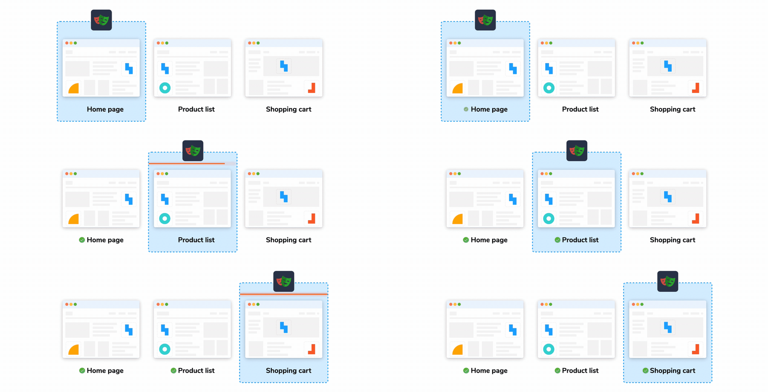
Introducing Chromatic's automated visual testing to Playwright
Verify functionality and appearance by bringing Chromatic into your E2E tests
TL;DR: Playwright's snapshot tests are a powerful choice for visual testing. Soon, you'll be able to take them even further by integrating Chromatic into Playwright, letting you run automated visual testing within your existing E2E tests. Sign up now for early access.
Playwright is essential for testing user flows to ensure they actually work (e.g. "sign up" or "add to cart" flows). However, these E2E tests only verify the logic. You still need to manually check each page to confirm that it "looks correct." In other words, you also need be on the lookout for visual bugs.
Testing for visual bugs is tedious. UIs are constantly changing, making it challenging to keep up with broken layouts, missing assets, and cross-browser rendering differences. Additionally, modern UIs are complex, with hundreds of components and thousands of states to consider. Writing assertions for every single visual detail is simply impossible.
Imagine if you could ensure that user flows work correctly and look right, without needing to write more tests. We're building a new feature for Chromatic that automatically runs visual tests on every step of your E2E test pages while Playwright continues driving the browser: E2E visual testing.
Read on to learn more and sign up for early access.
What is visual testing?
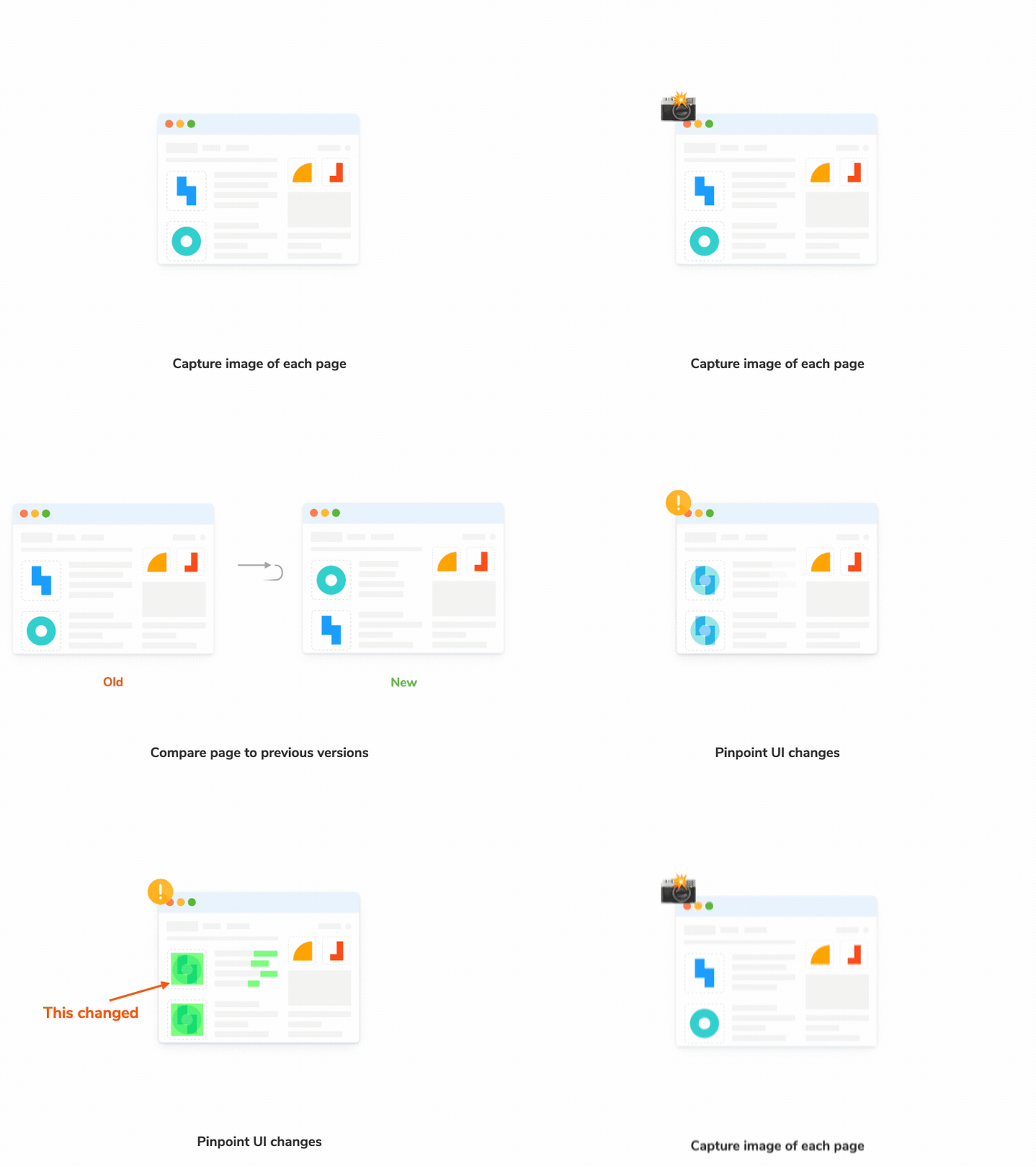
While E2E tests verify that things work right, visual tests verify that things look right.
Visual tests detect bugs in UI appearance by capturing pixel-perfect snapshots of the rendered UI, including styling and static assets. These snapshots are then compared to baseline snapshots as you commit code, helping to catch UI bugs.
These are not to be confused with general snapshot tests, which compare blobs of text to check for differences.
Where does visual testing fit in your testing strategy?
Visual tests complete your testing strategy by offering a new aspect to check against: the appearance. With little effort, they provide a reliable check for how things actually look in the browser.

Let’s say you’re a developer on an online shopping product. You’re tasked with verifying how data flows from the backend to the frontend for a critical product detail page. In particular, you must test the all-important “Buy Now” button.

Using traditional E2E testing methods, you might create a test like the one on the left. But if you’re able to use Chromatic's E2E visual testing, it’s as simple as the test on the right.
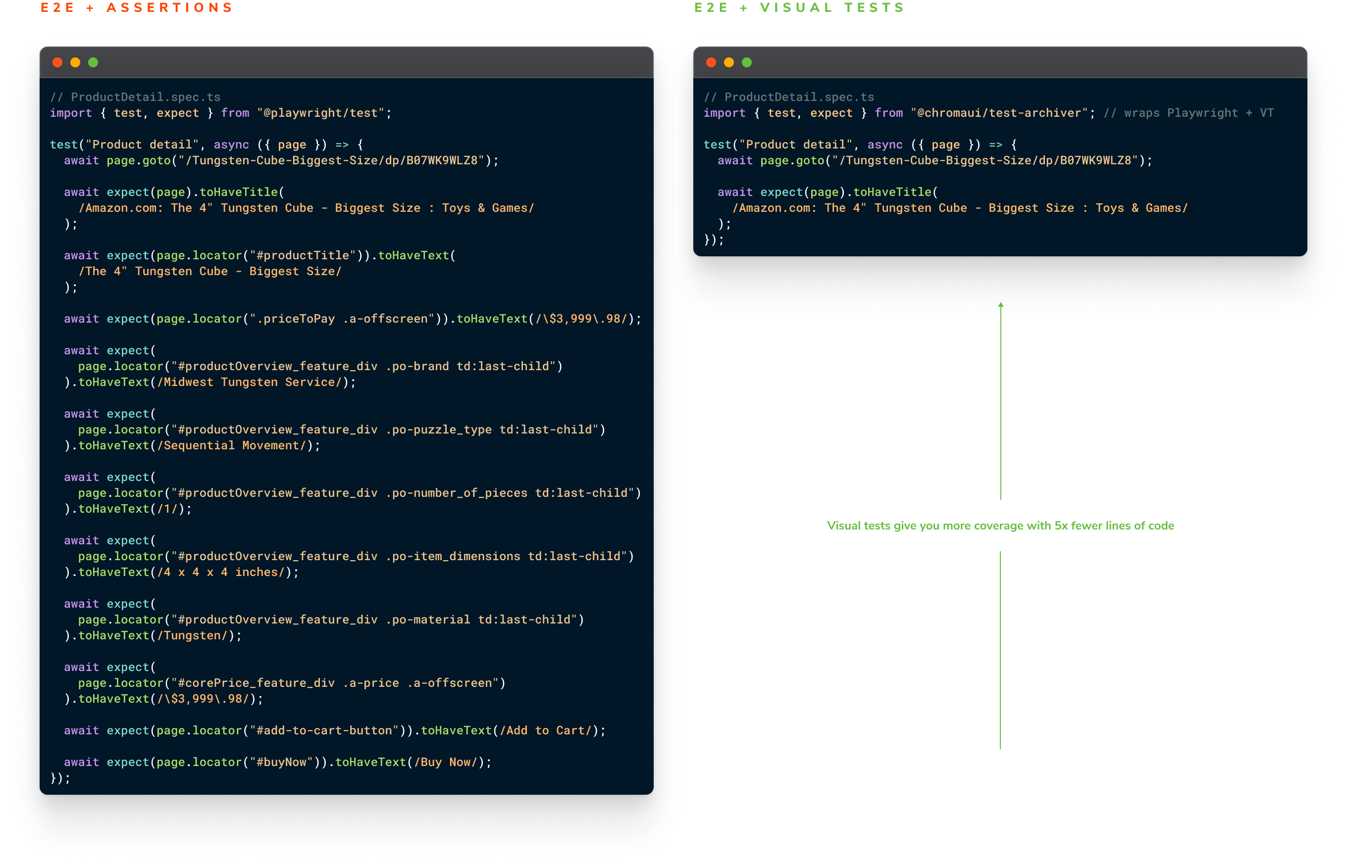
The visual test on the right will take an image snapshot of the page, which allows you to verify all of the information tested on the left with a single glance. Not only that, you’re testing that the data flows correctly and that the appearance of the page is correct, too.
This is a dramatic reduction in the work you need to do to write and maintain tests. In the example above, it’s 5x fewer lines of code.
Reuse Playwright tests for visual testing
Because the code above is so minimal, you effectively get visual tests for free. How does that work?
A library sits on top of Playwright’s browser automation and takes snapshots of tested pages. This gives you comprehensive visual coverage of every key page in your app. All without instrumenting a bunch of assertions or maintaining those assertions when your app changes.
There are a couple more handy benefits:
- Less work: Visual tests run as part of your existing Playwright E2E test suite. Configuring and doing the setup work for tests can be difficult and time-consuming. With visual tests, you can reuse your test data, mocked modules, and other configurations with any extra code.
- Findability: Visual tests are colocated alongside Playwright tests. A snapshot is automatically captured at the end of a test with the option to capture more snapshots at any point mid-test. This simplifies organization and find-ability without switching tools.
How to integrate visual testing in Playwright
Set up Chromatic's E2E visual tests by replacing one line of code. The visual test package, @chromaui/test-archiver, wraps the @playwright/test package to generate snapshots of pages in your Playwright tests.
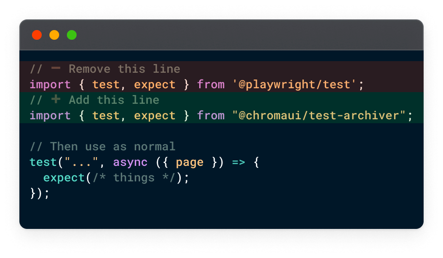
Now, instead of manually checking your app for visual changes, your workflow can look like this:
- Push code to kick off CI jobs (Playwright + visual tests)
- Automatically detect visual changes
- Review changes to check if they’re regressions or intentional updates
- Fix regressions or accept changes as new baselines

Get first access
Our team at Chromatic are building E2E visual tests to help you catch UI bugs in Playwright tests automatically. We're currently getting ready for our pilot and there are still some places available. If you’re interested in getting early access (and free usage), fill out the form to see if your company qualifies.
👉 Sign up for early access to E2E visual testing
FAQs
Why not use Playwright’s built-in screenshot feature?
Visual testing is a multi-step process. Playwright’s screenshots are one part of the process. To create a visual testing workflow that devs actually want to use, you’ll also need to store those screenshots, review them, orchestrate CI to capture them, and integrate with Git for PR checks. We handle all that for you and maintain it over time.
What’s more, Chromatic E2E visual tests capture both screenshot and a web archive of the real page (DOM + assets). This allows you to reproduce how your app renders in a real browser, in the same way your users do. No need to step through the entire E2E test again in order to debug, you can jump straight to the page with visual changes.
