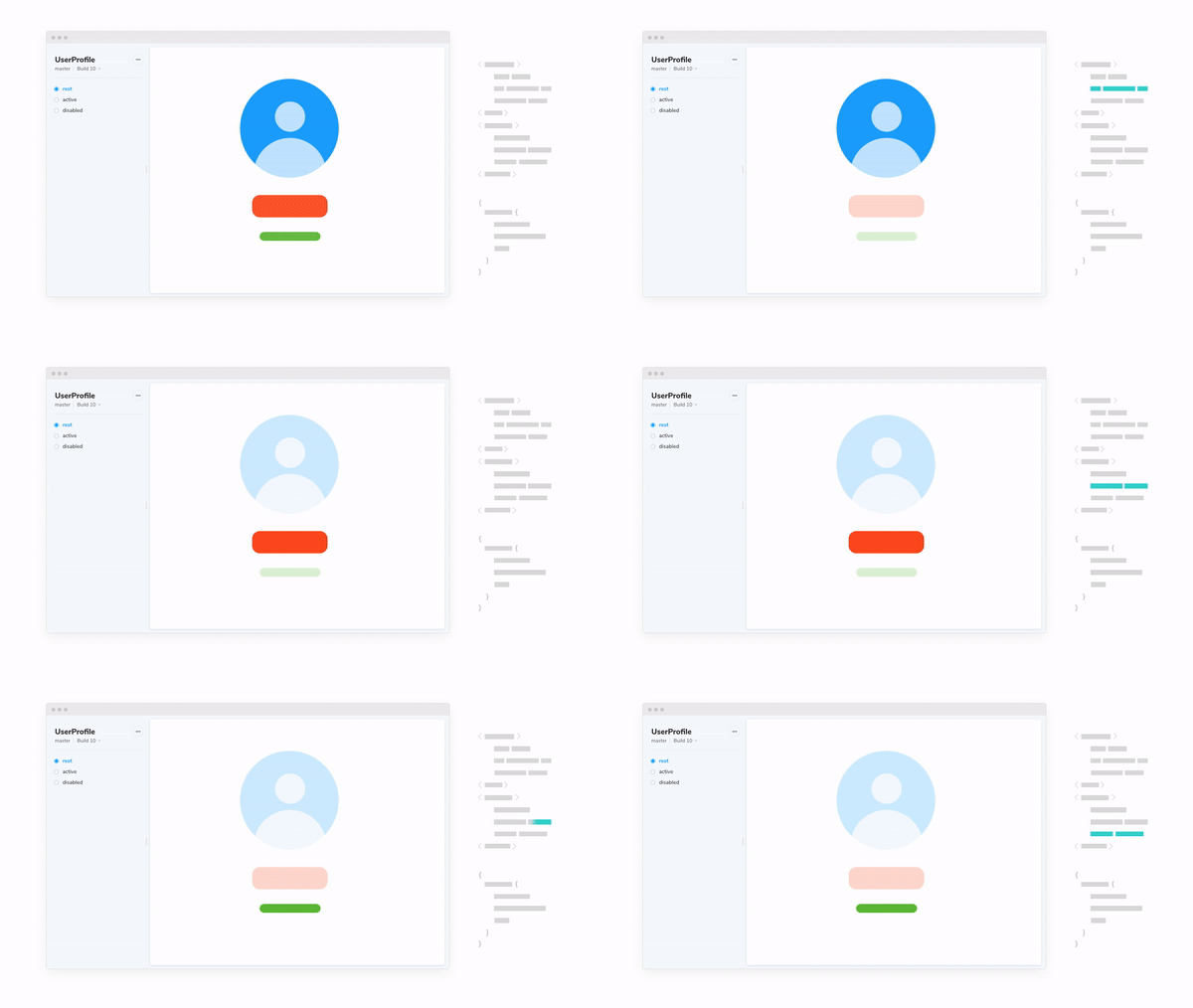
Live view
Chromatic update: Easy reproductions with fully-inspectable UI components
2018 brings a fresh outlook, a new belt size, and Chromatic updates!
While it’s impossible to go back to 2017’s best moments, it is now possible to inspect the past look and feel of your UI components.
The goal of this update is to streamline the component review workflow.
Sign up below for free & unlimited Chromatic usage during early access!
Live view (beta)
Live view shows you the fully-inspectable working version of each component every commit, just as you’d see it in Storybook. This makes reproducing and confirming changes effortless.
Your team can QA, review, and confirm UI components without ever touching code. In most cases you can complete visual reviewing without ever leaving your browser tab.
Reproductions are painful. They’re often sparsely documented and time-consuming to get in the right state. While Storybook alleviates some of this pain, it’s still tedious to check out code and start Storybook just to confirm changes. With Live view you don’t need to be in front of your development machine, pull code, or use the command line to review UI changes.
Available now for select Early Access users and rolling out for everyone over the next few weeks.
Use cases:
- Developers inspecting UI markup for accessibility and cleanliness
- Designers reviewing changes to design systems
- QA team confirming the appearance and interaction of UI components

Component sizing algorithm
Chromatic has a revamped algorithm to better calculate the dimensions of component screenshots. In particular, it should help if your component overflows its container’s bounds; especially when using a portals-like technique to render outside of the container completely.
Snapshotting components is nuanced. While it’s straightforward to take a screenshot, the devil is –as always– in the details. A detail we often consider is how to crop component images.
The crop determines the dimensions of the image snapshot and where the component appears in that snapshot. Ideally, you want the crop to be at the boundaries of the UI component. This maximizes the amount of visual information users see. Chromatic’s new algorithm makes sure we get more of your component in the screenshot more of the time

And more
- New package: The latest react-chromatic v0.7.8 contains updates and bug fixes
- Performance: The performance of the web application was fine tuned. This resulted in vastly sped up browsing of components and builds.
- UX: We now use the display name in the UI for nested components. For example, Webapp components/Foo will appear as Foo. (Upgrade your package)
Try Chromatic for Storybook
Chromatic is the visual snapshot testing tool for Storybook.